Bringing ideas to life with designs that speak, solve, and succeed.
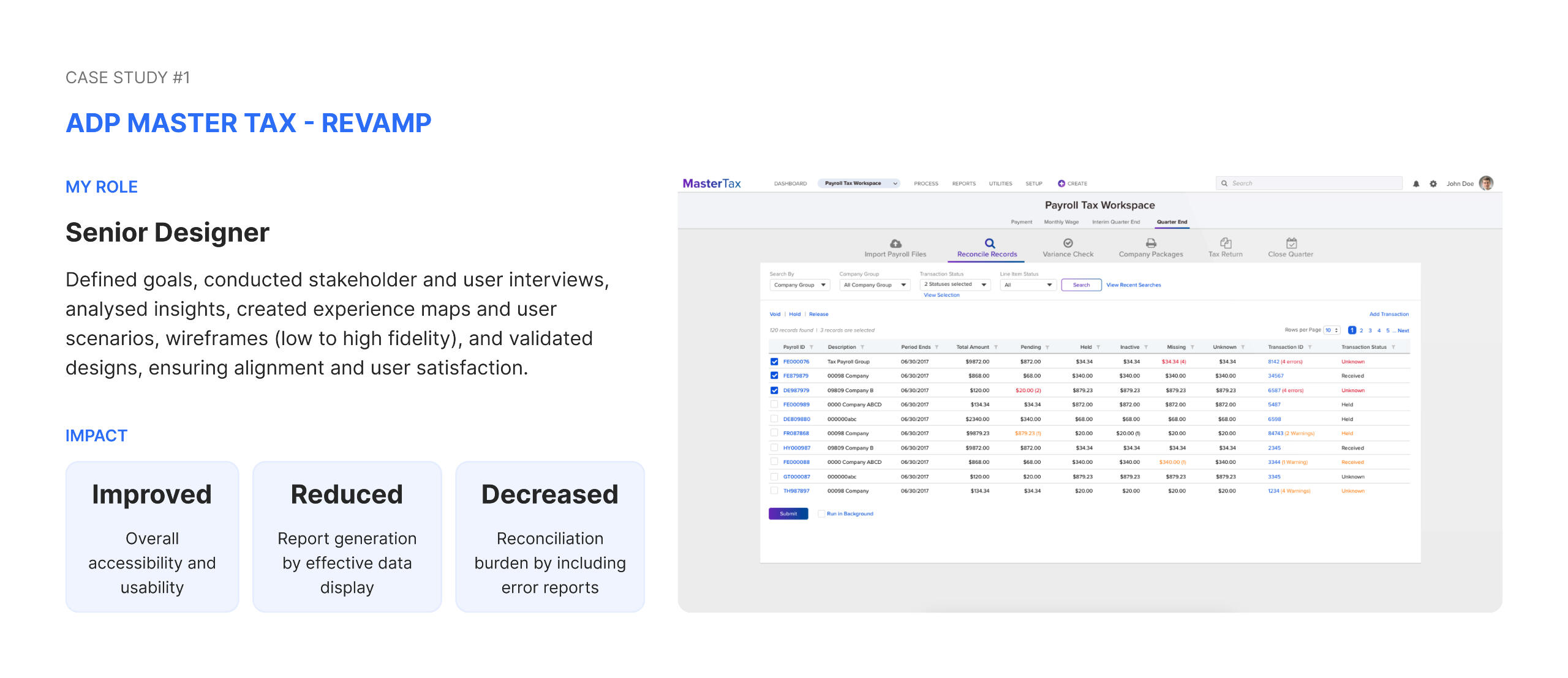
Co-founder of Keen UX Studio, delivering innovative solutions for diverse clients. Previously enhanced the purchase and post-purchase journeys at ZALORA and spent 7+ years crafting enterprise products at ADP and HEXAGON AB, focusing on user-centered solutions that drive efficiency and user satisfaction.
💼 Work
ADP: Human Capital Management Platform (B2B)
Web, Design System
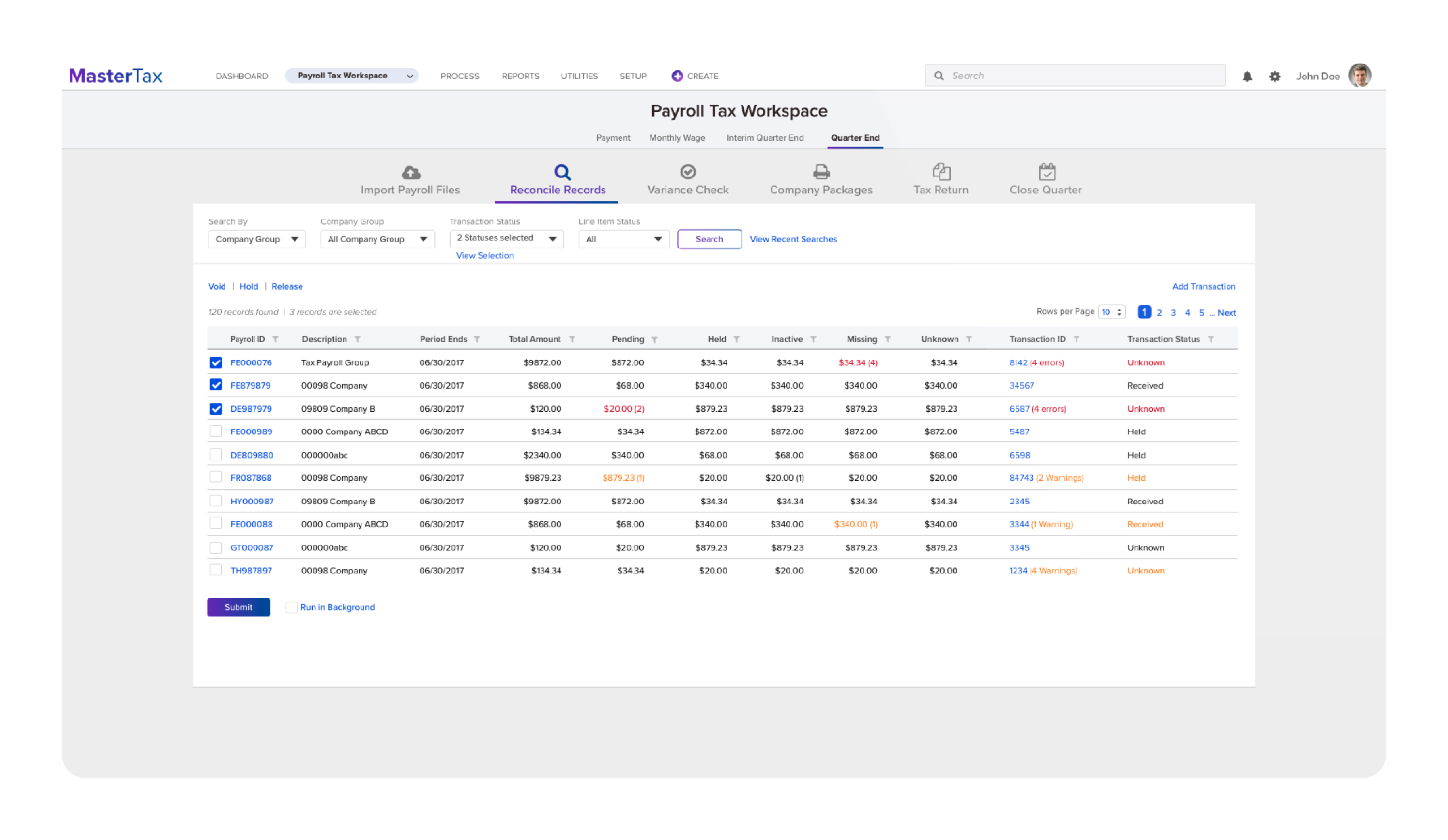
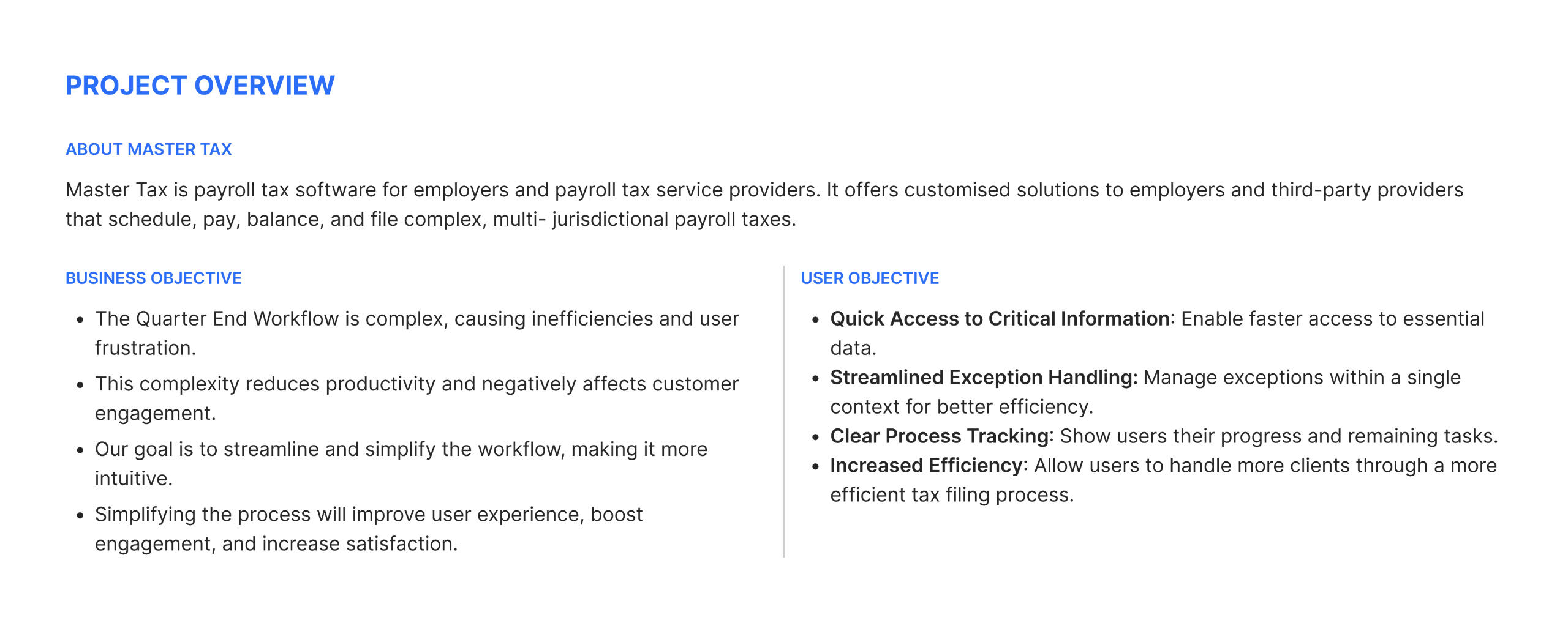
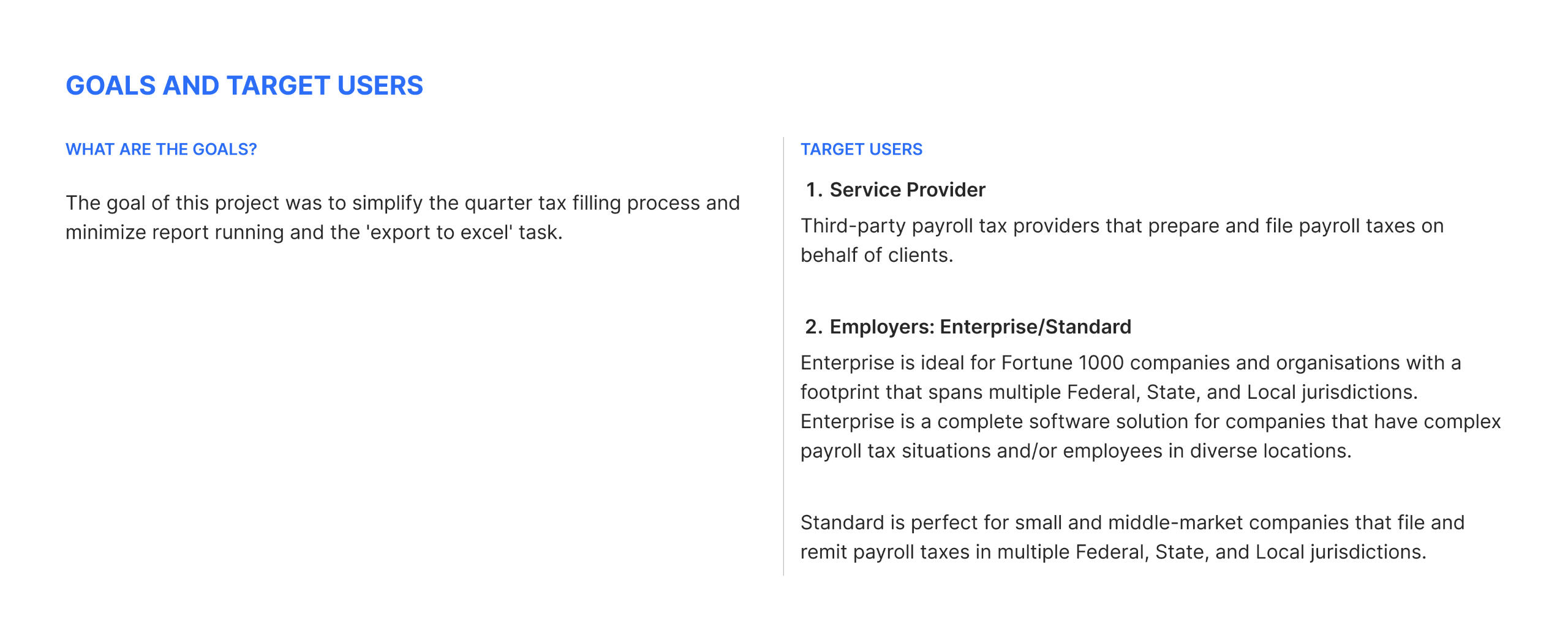
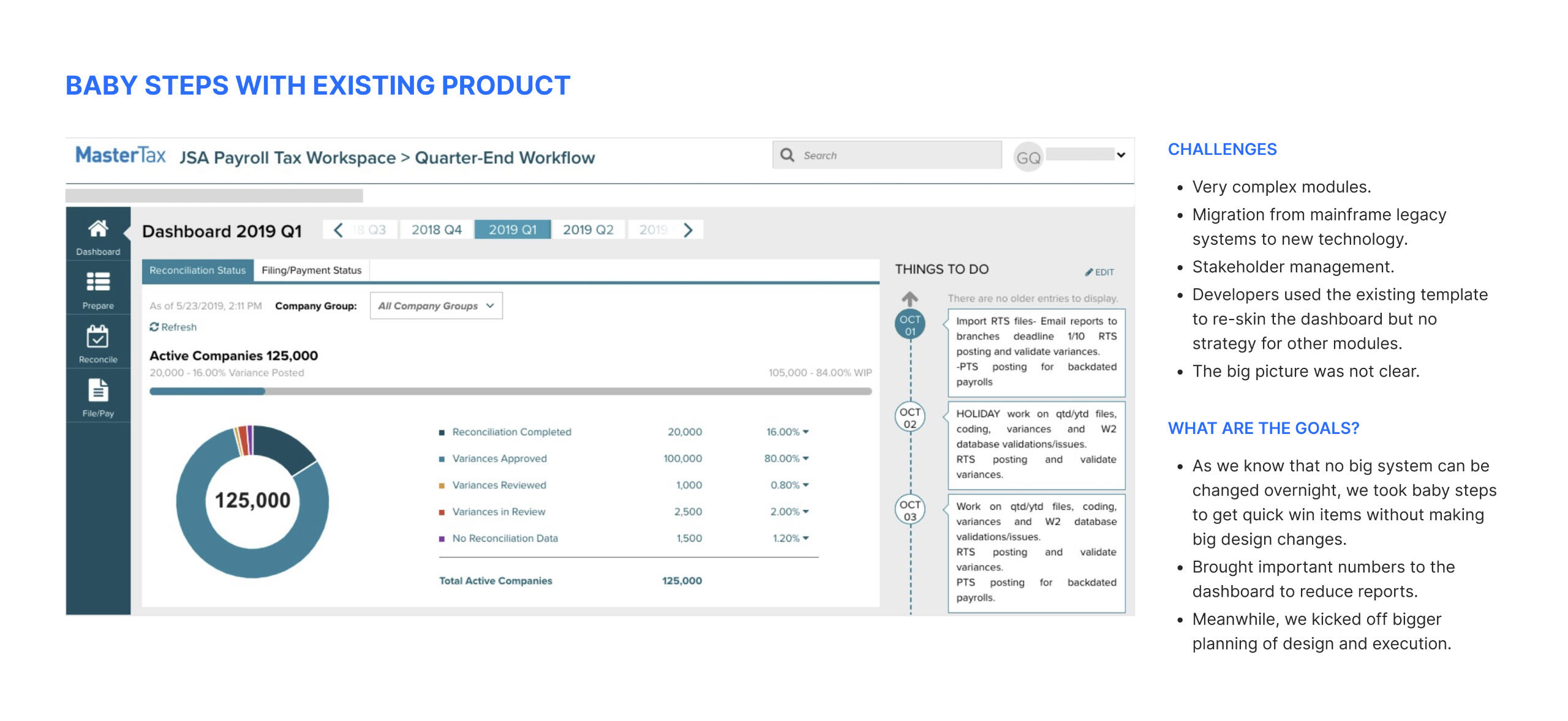
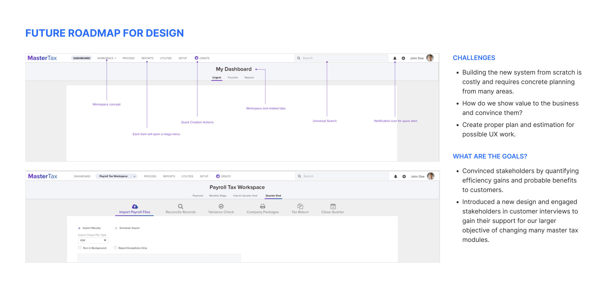
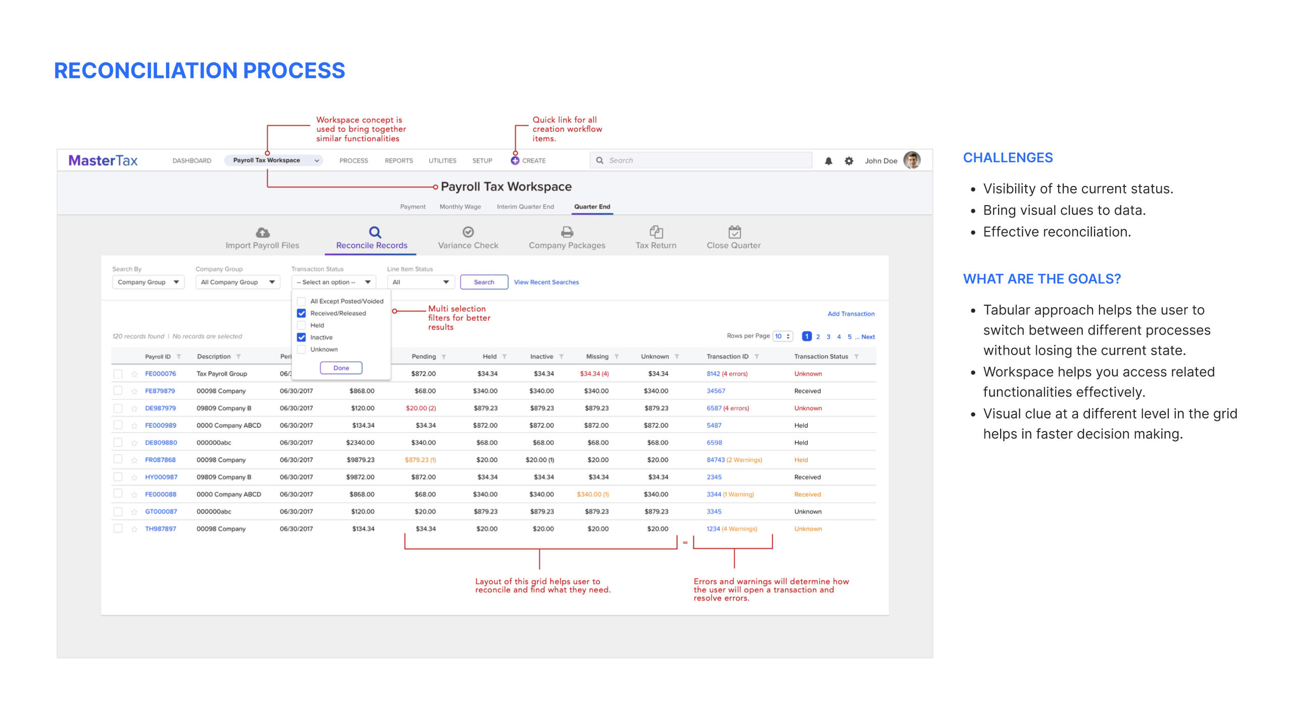
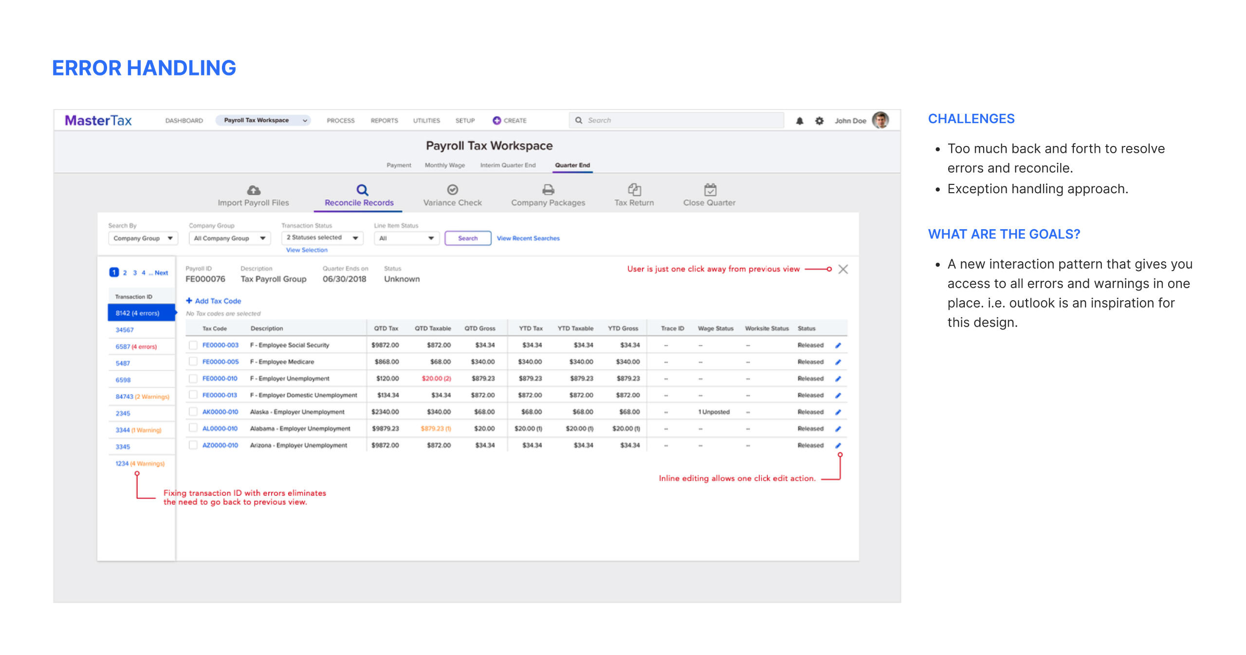
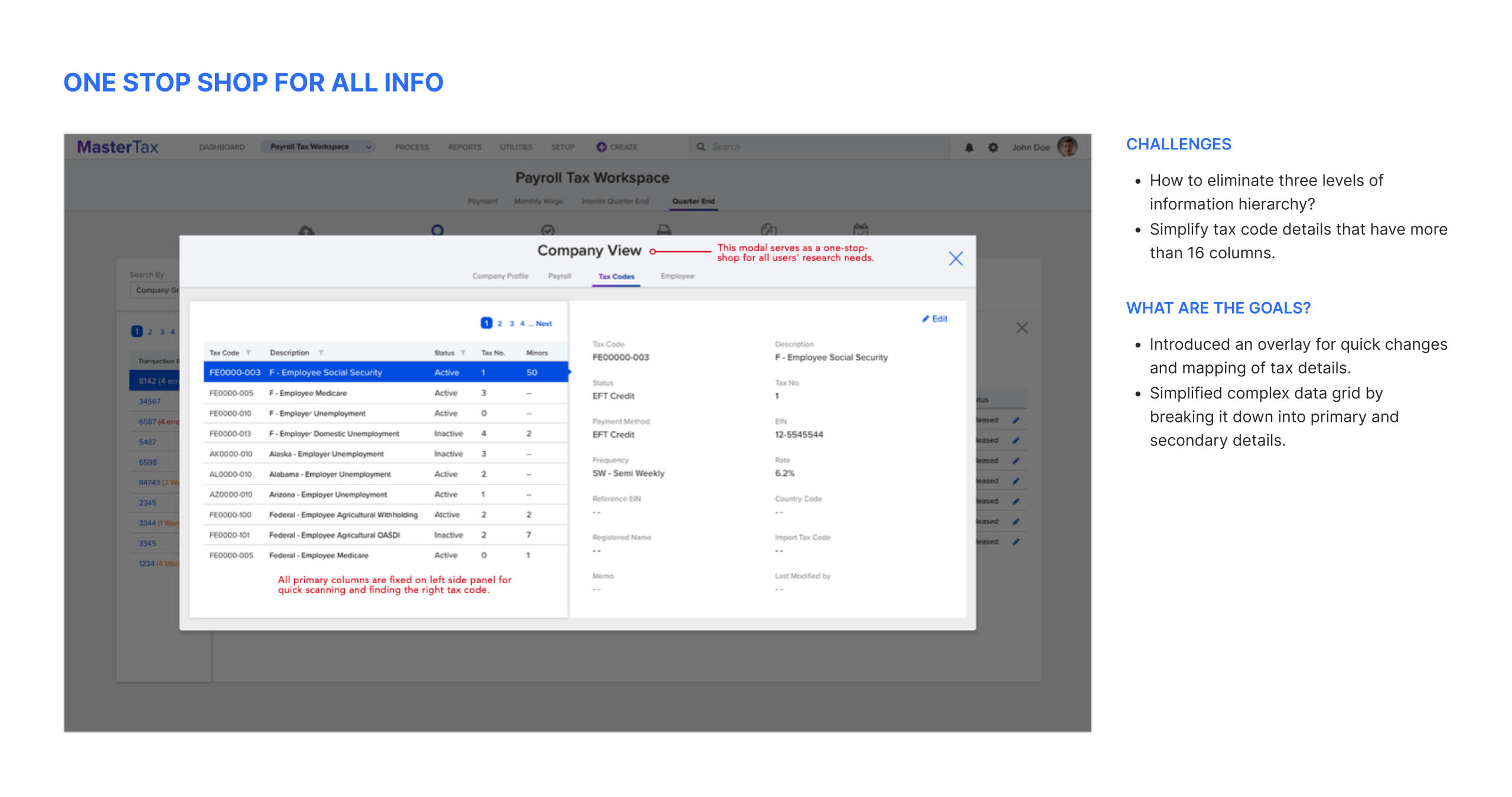
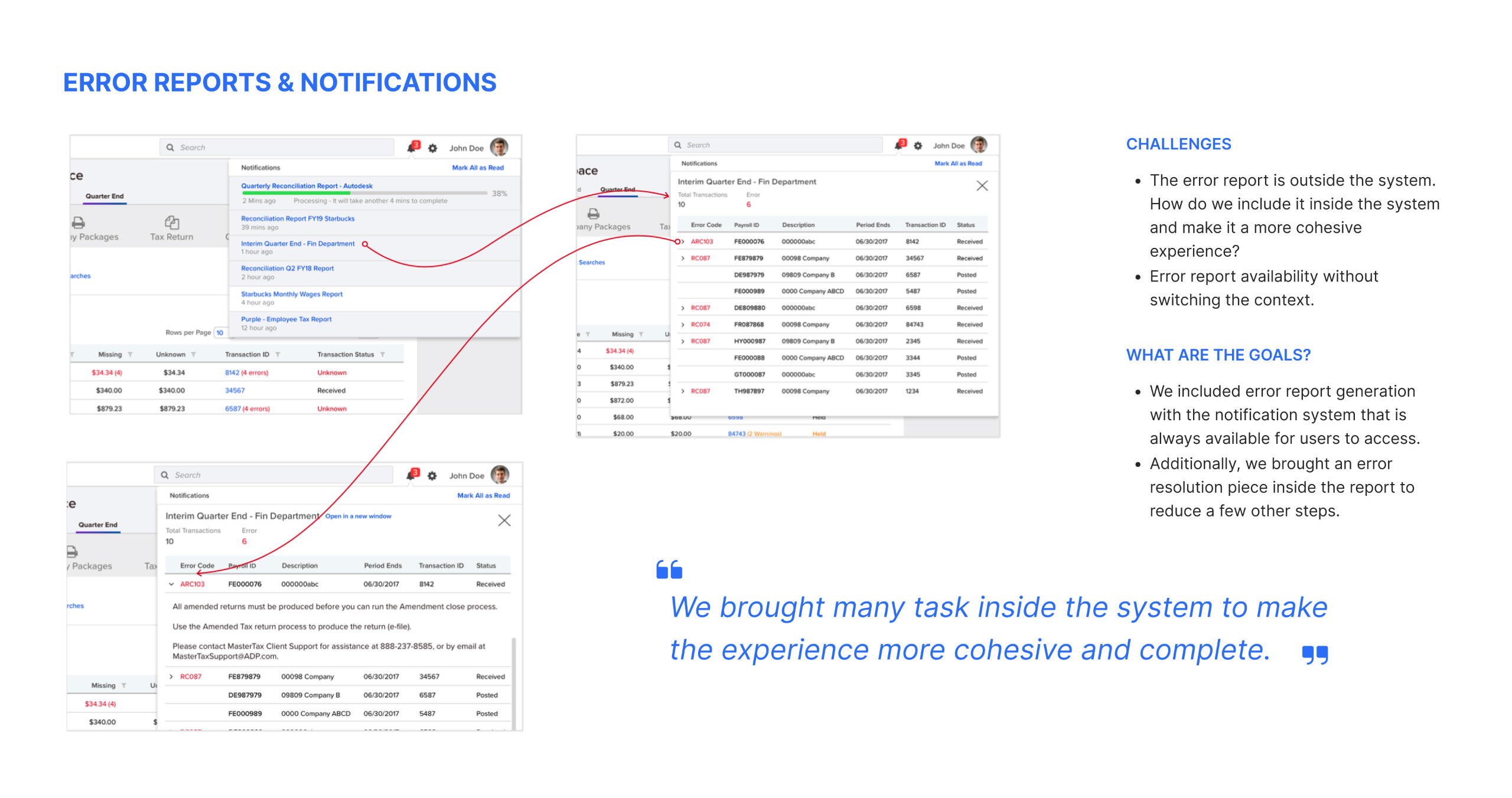
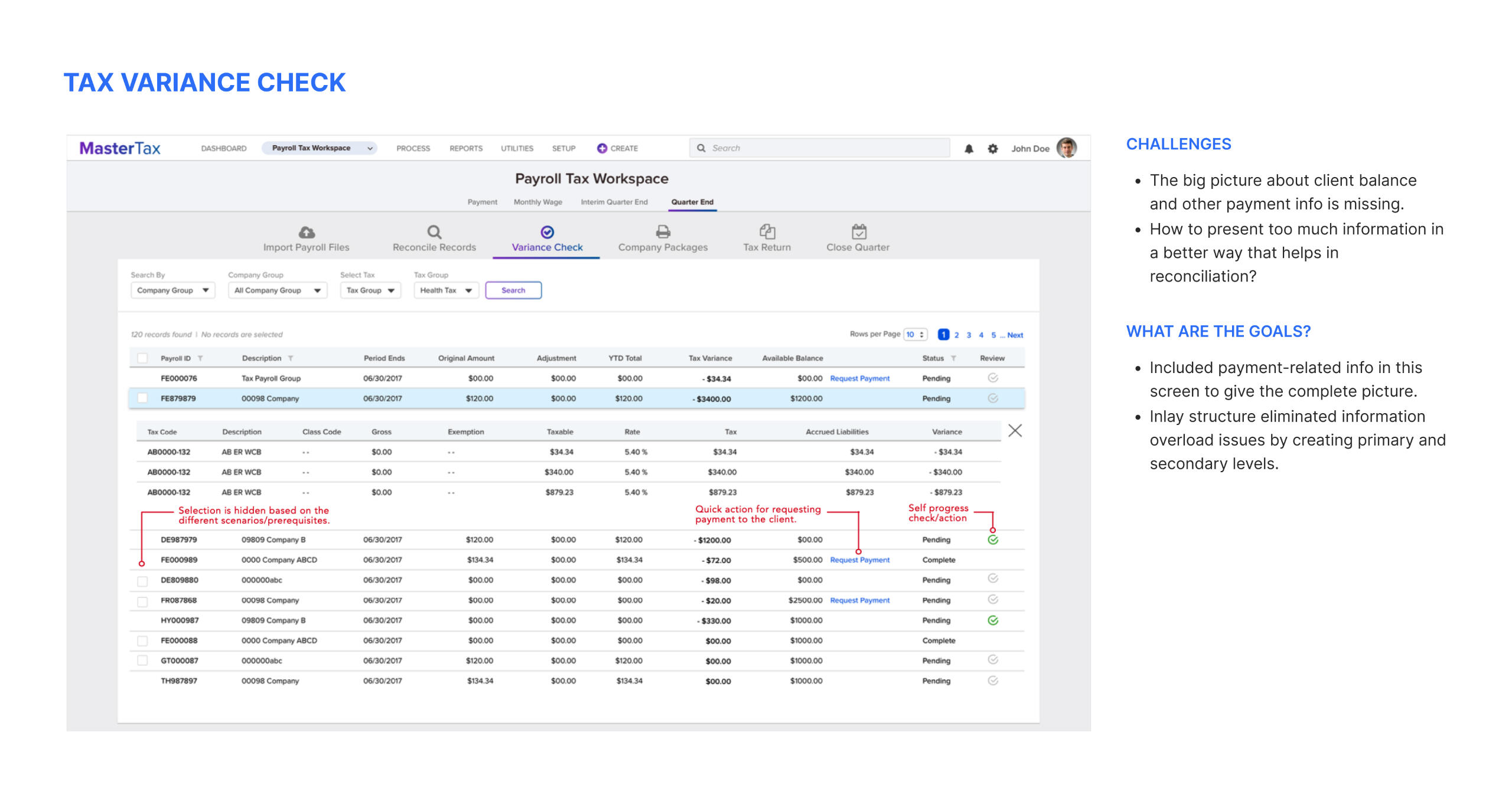
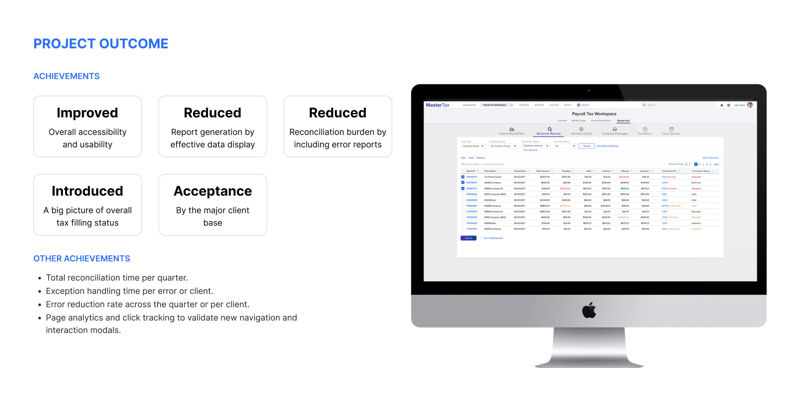
ADP Master Tax - Revamp
2018 | Web | Improved accessibility and usability
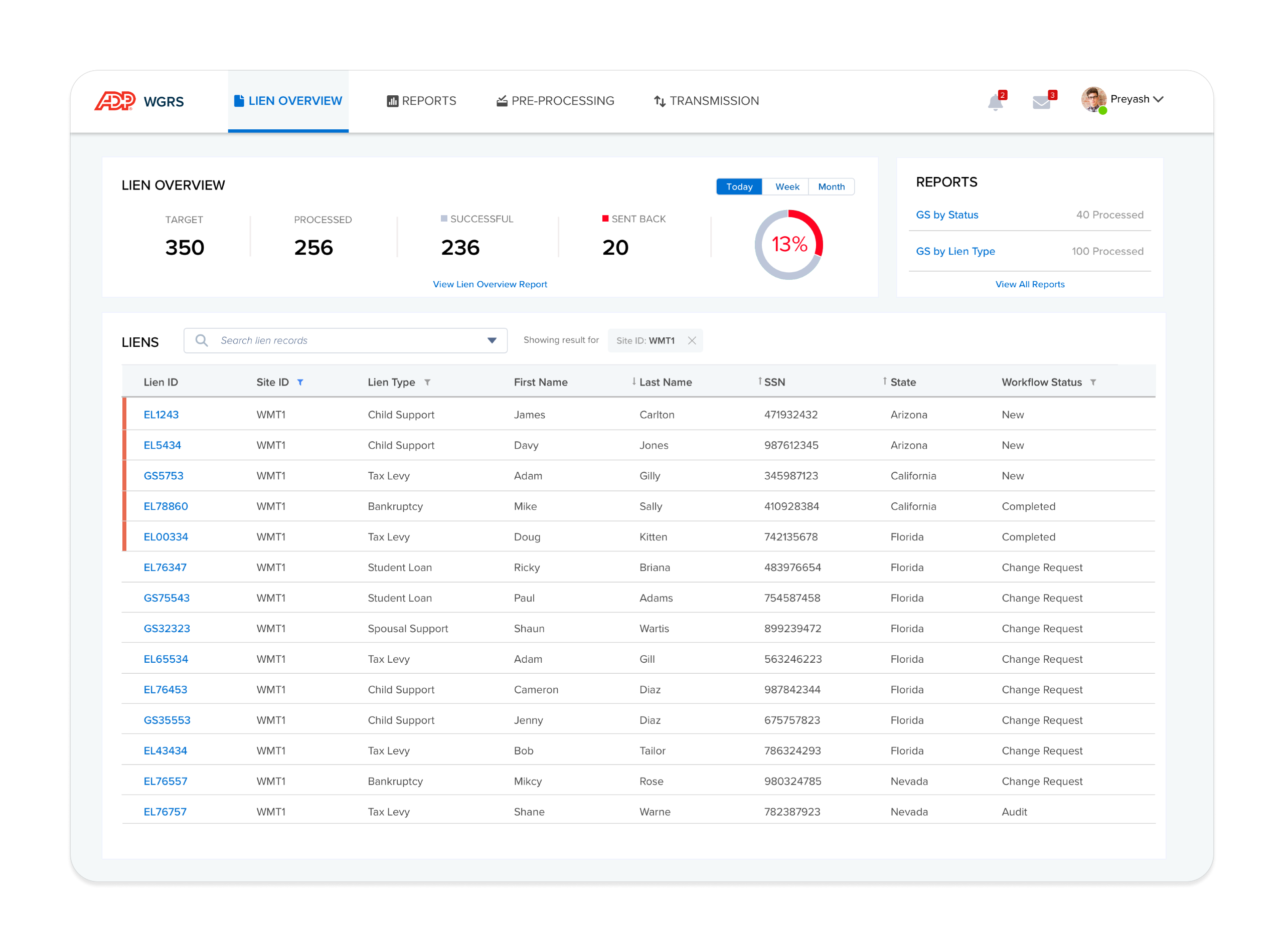
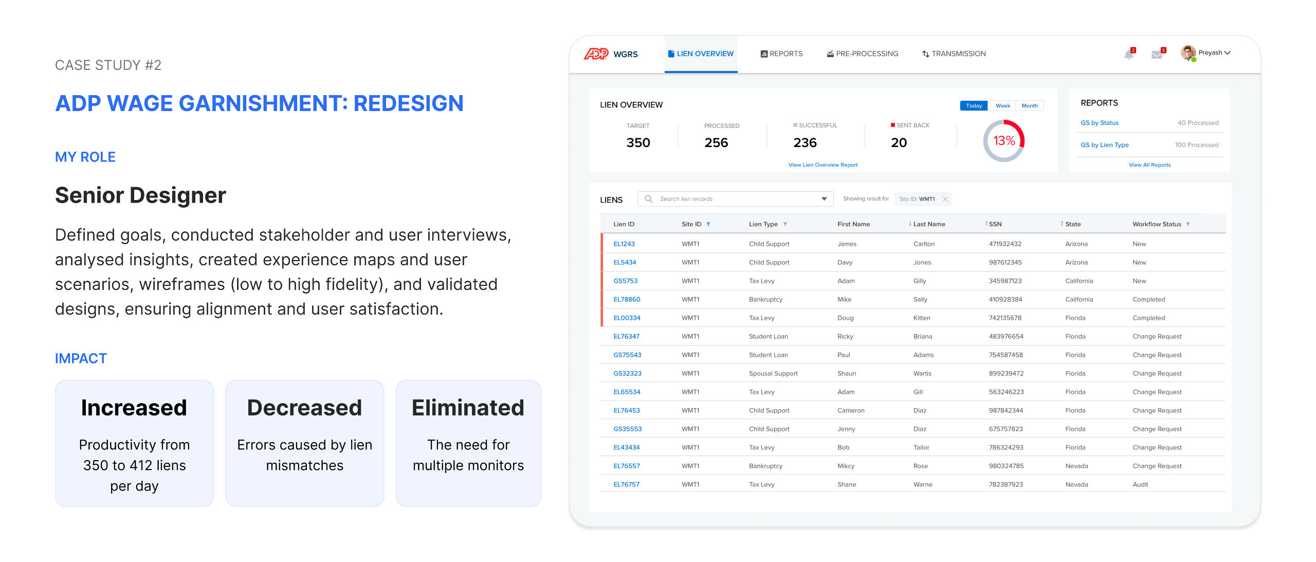
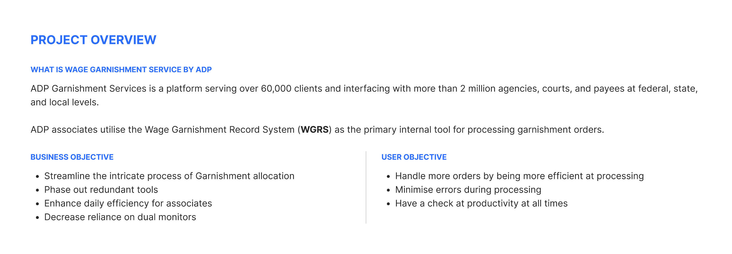
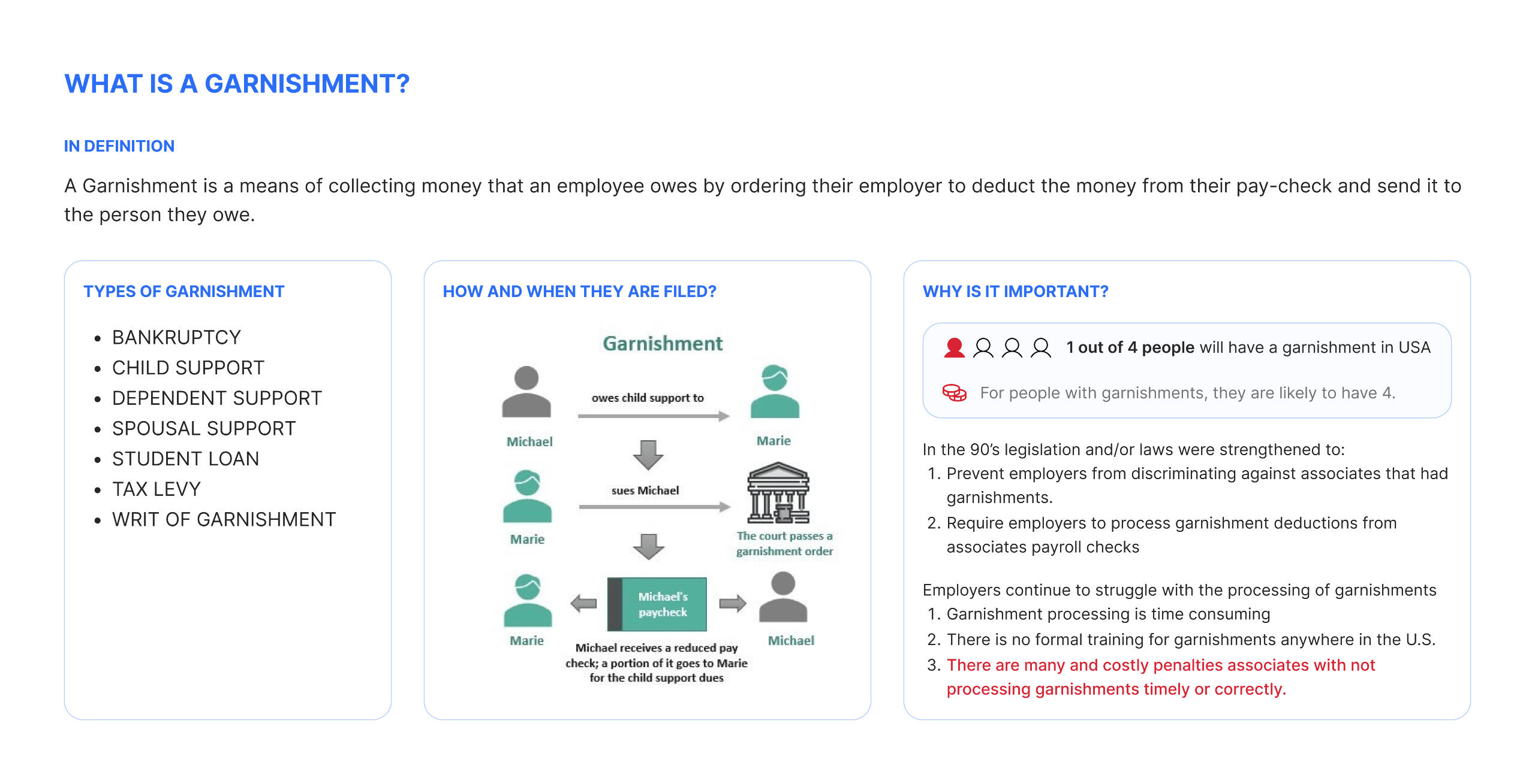
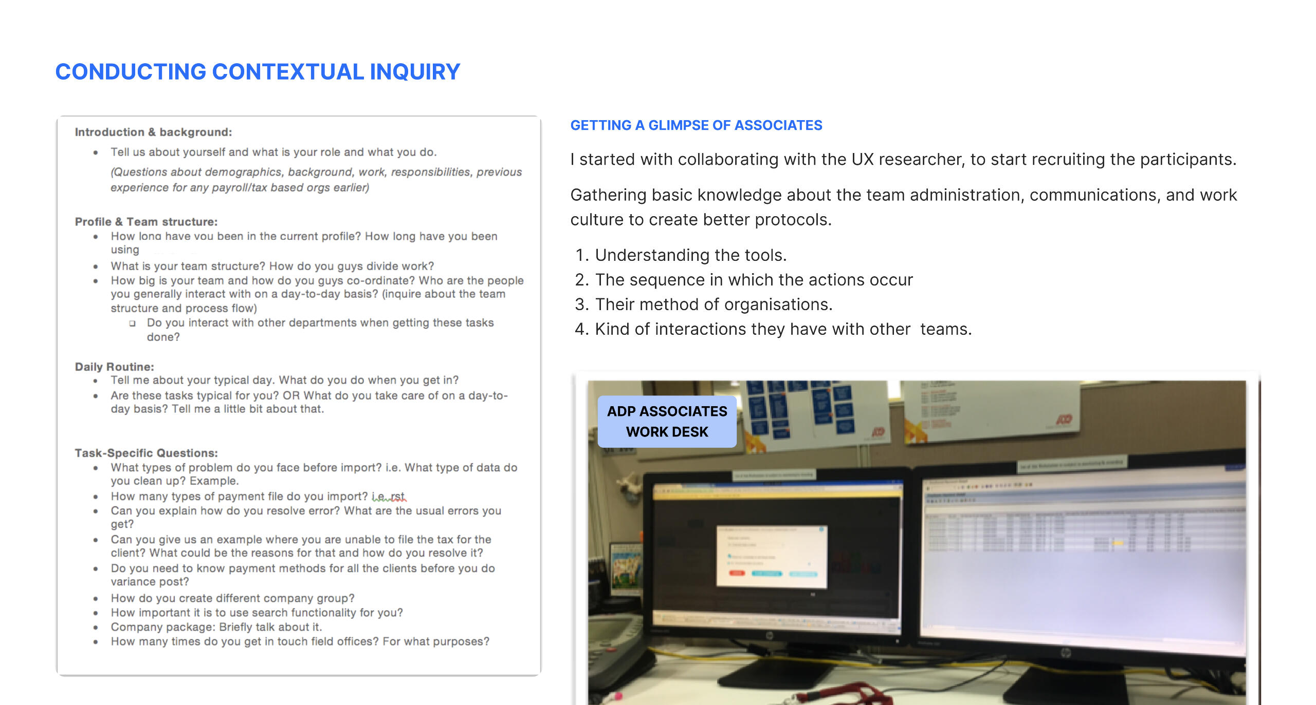
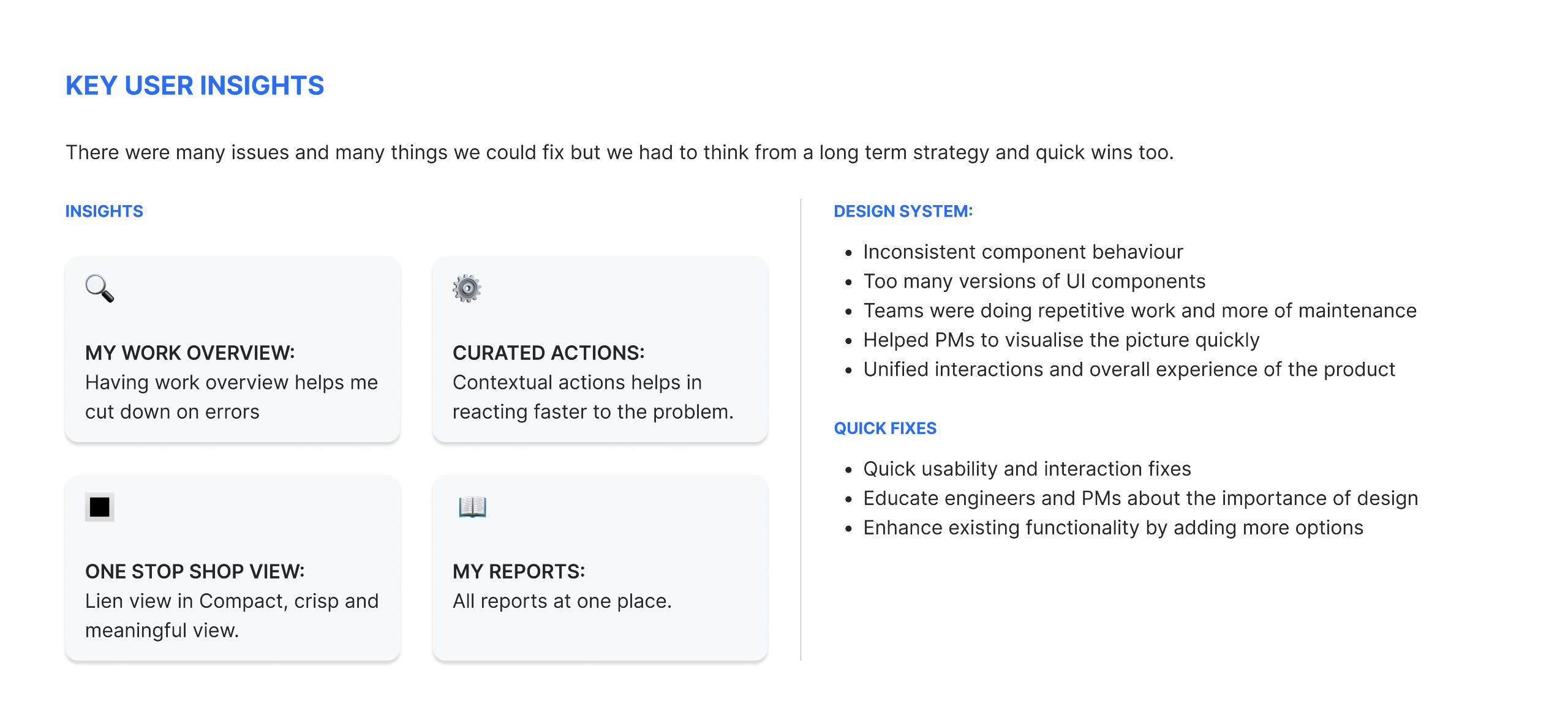
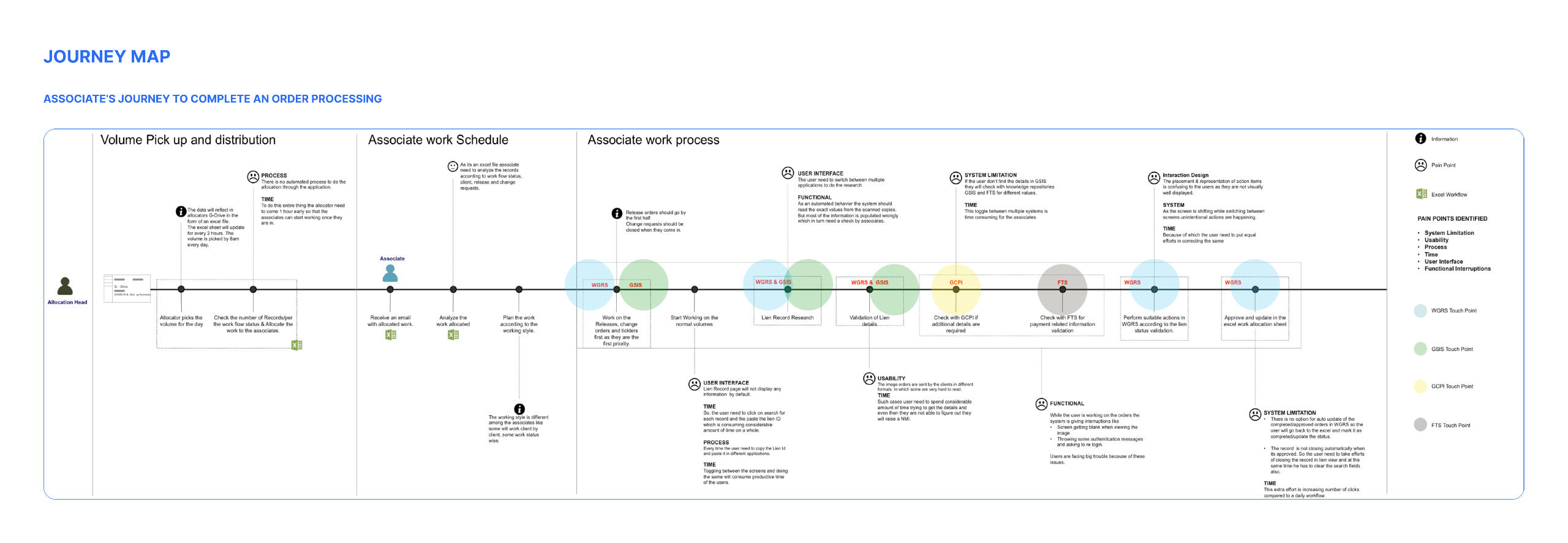
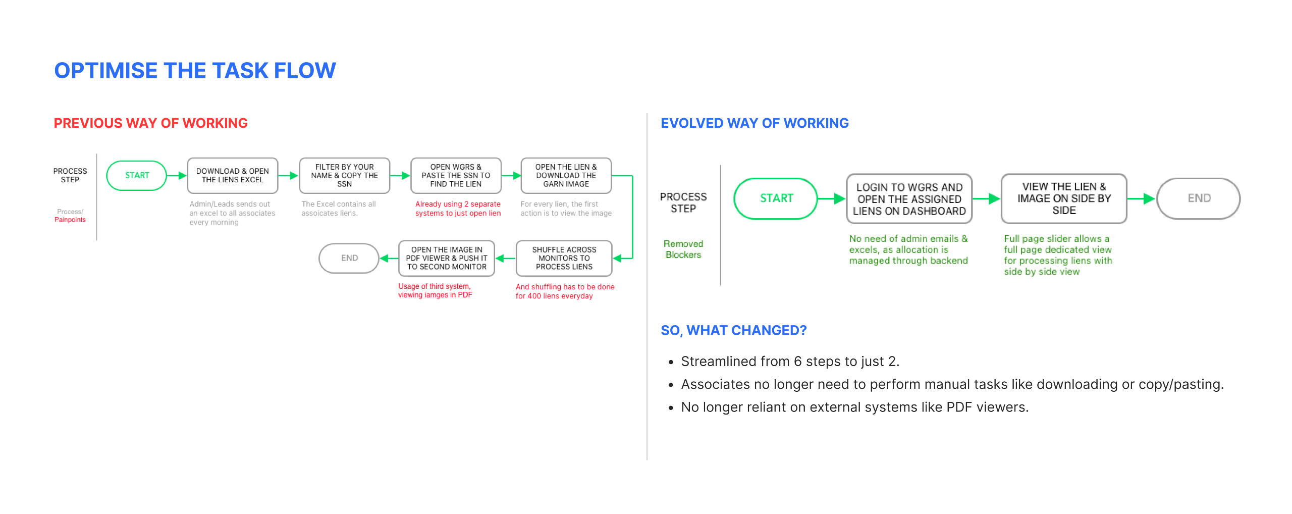
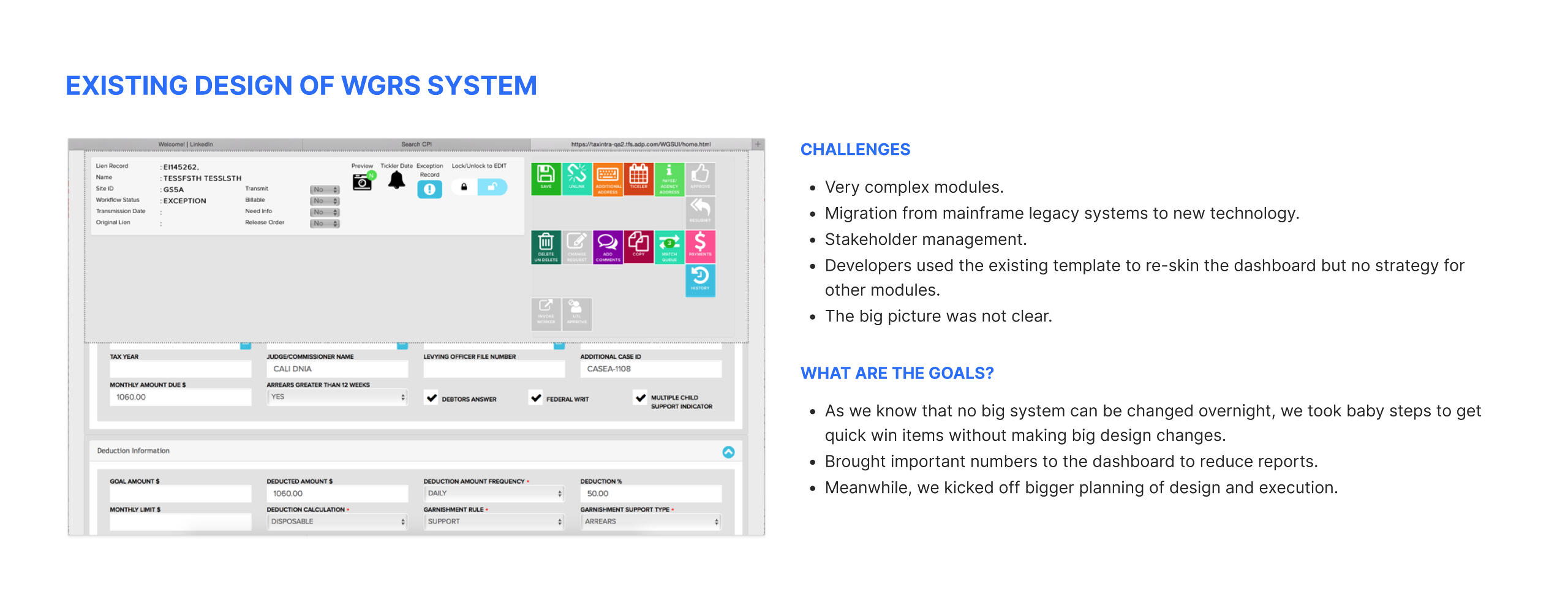
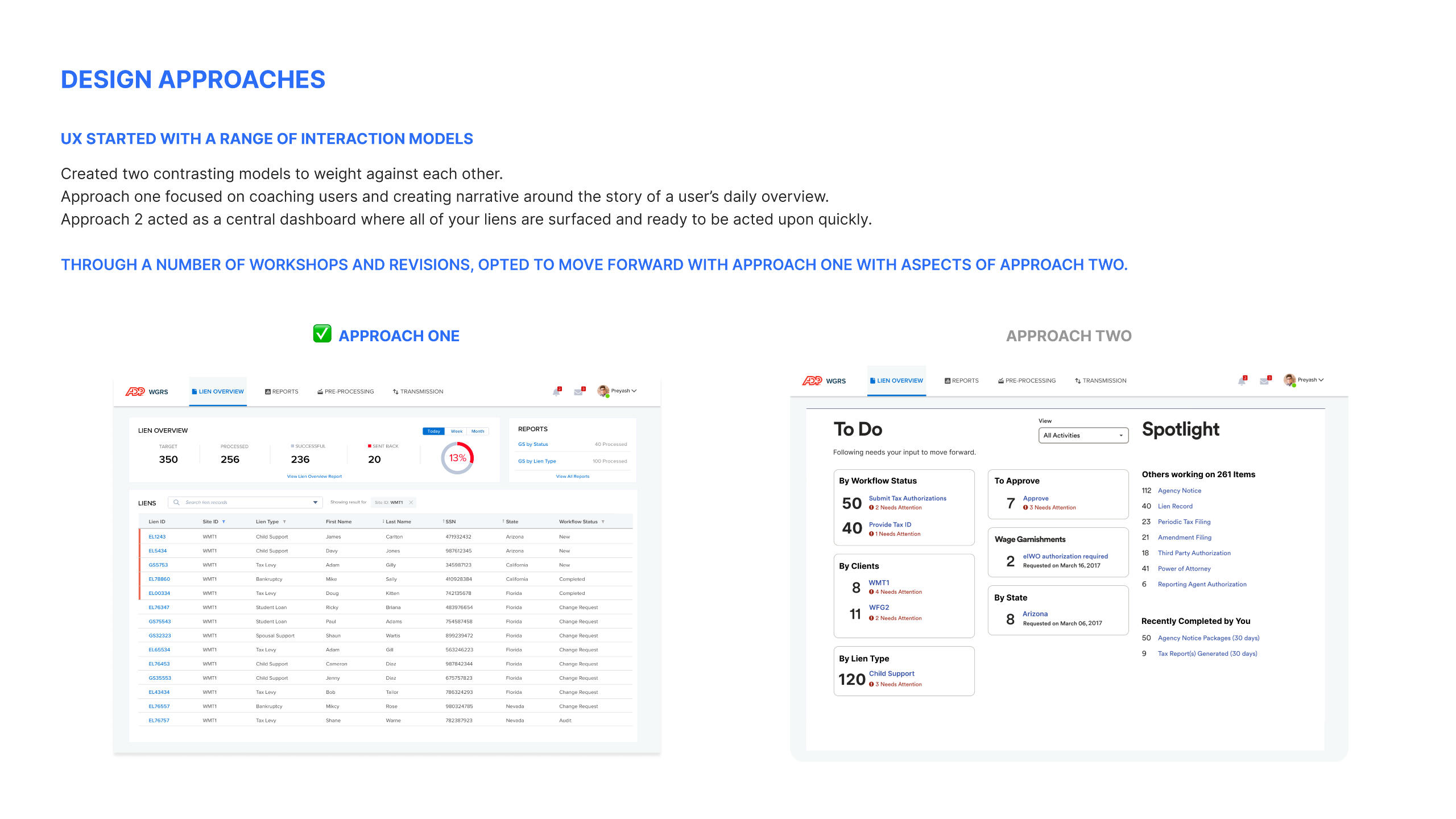
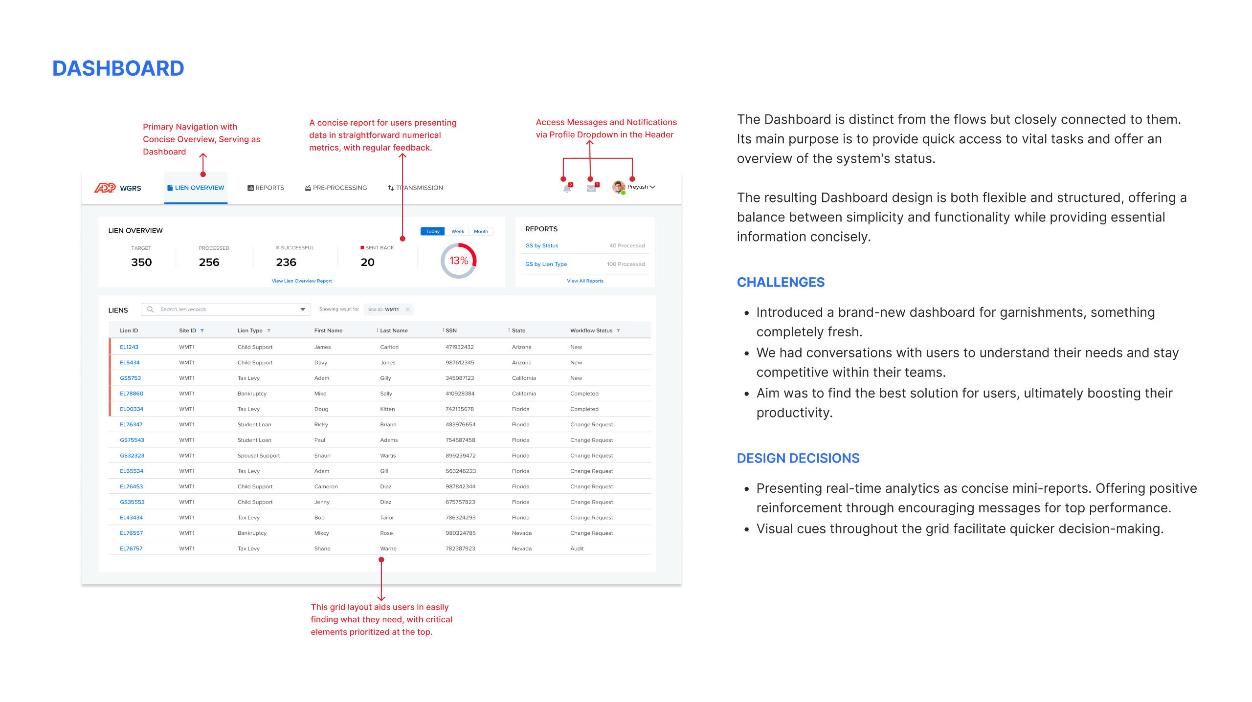
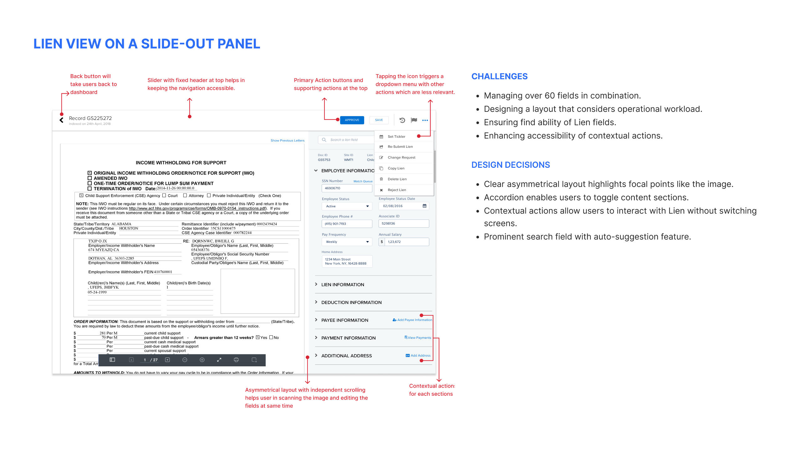
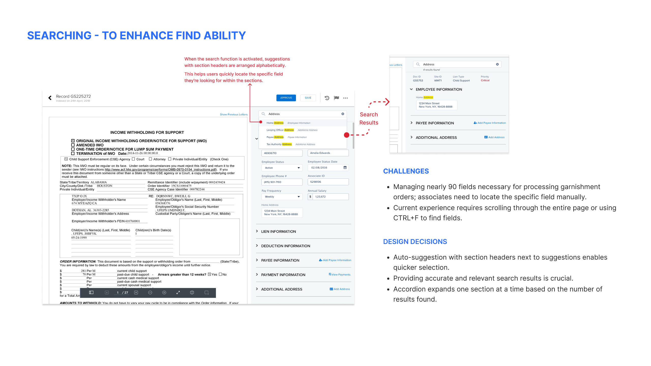
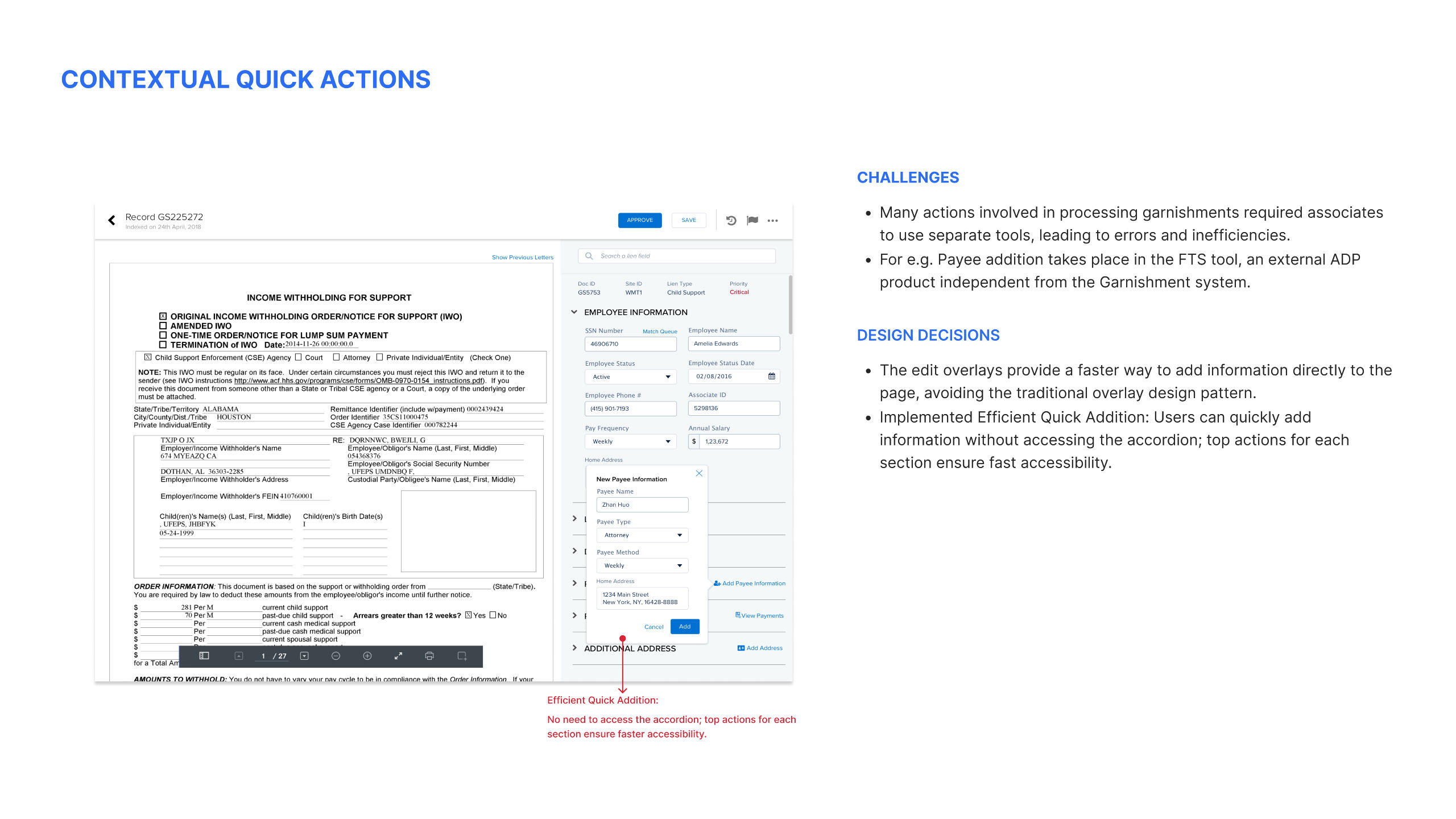
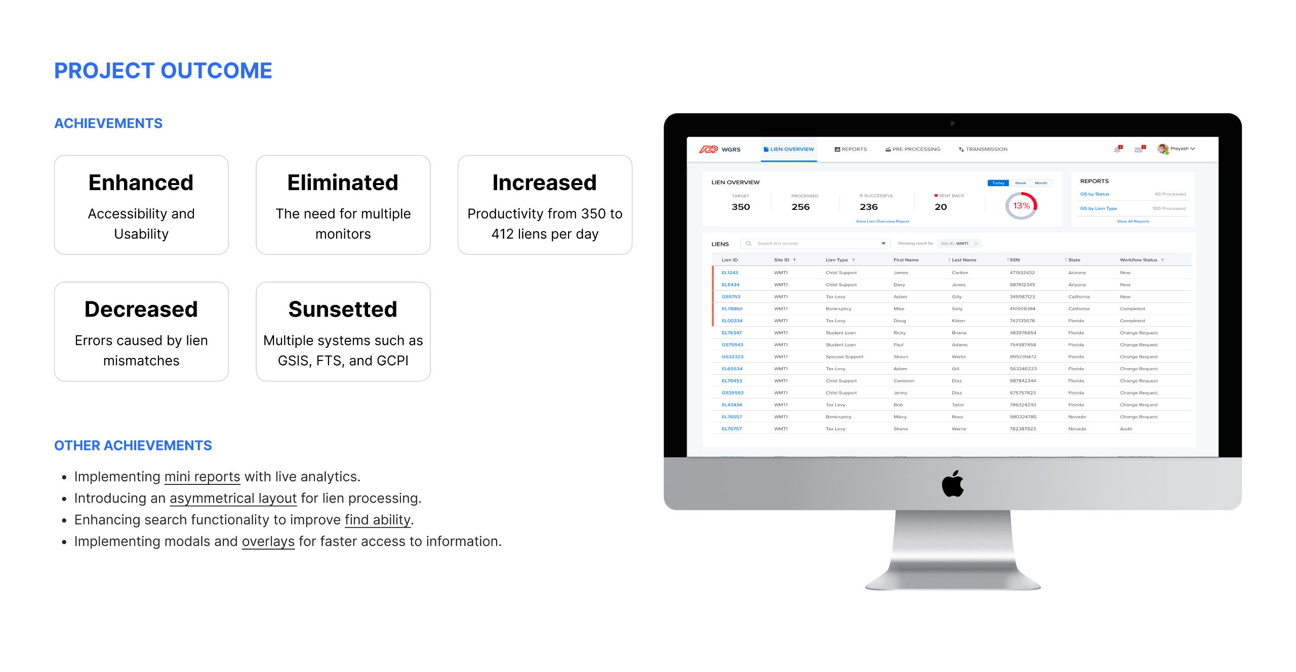
ADP Wage Garnishment:
A Ground-Up Redesign
2017 | Web | 20% processing enhancement
ZALORA: E-Commerce Platform (B2C)
iOS, Android, Web, Design System
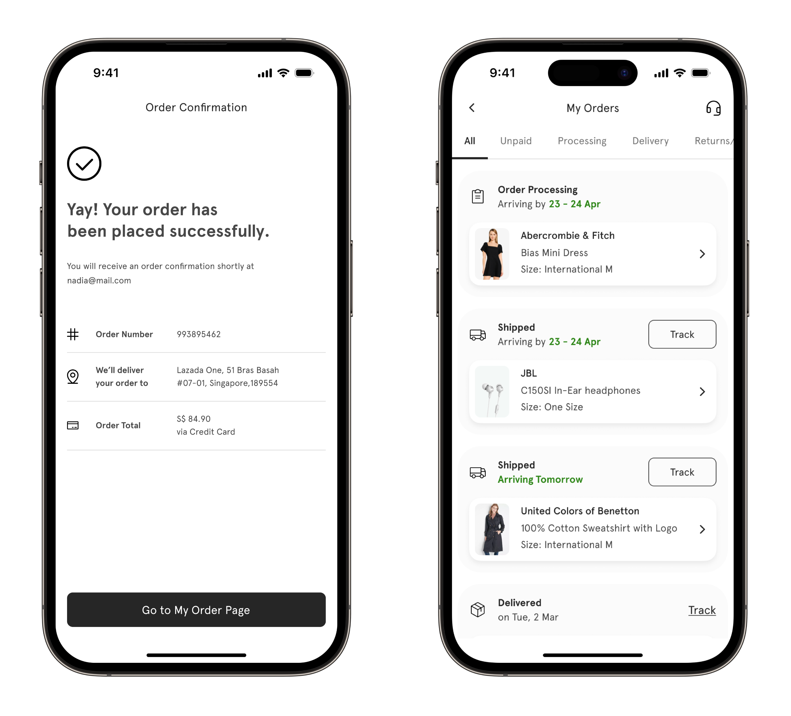
ZALORA Post Shopping
Made Smarter
2022 | Mobile | 6% decrease in contact rates
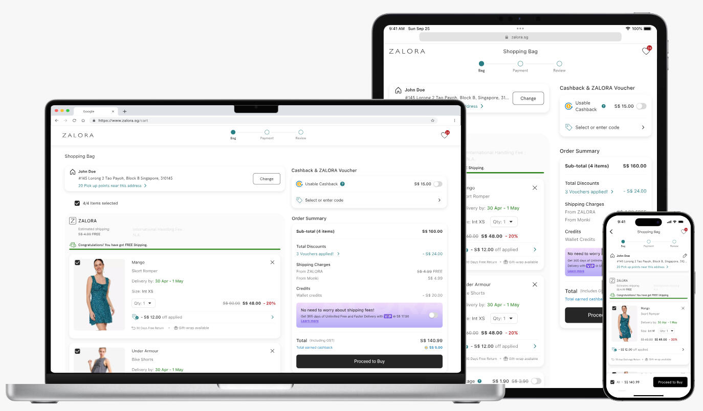
Enhancing ZALORA
Shopping Experience
2022 | Web, Mobile | CR Uplift by 6.45%

Greetings! 👋 I'm Pankaj
A Product and Interaction Designer with over 10 years of experience. I’ve had the opportunity to work with leading brands like ZALORA, ADP, and Hexagon AB, where I focused on scaling products into meaningful and delightful user experiences that align with both consumer needs and business goals.My journey has taken me through various environments, from agile teams to more traditional setups. I’ve contributed as part of large design teams and thrived in solo roles, always championing user-centered design with a "Form follows Function" approach.Now, as Co-founder of elev-8, my own design studio, I continue to push boundaries and create innovative solutions for diverse clients.Outside of work, I enjoy spending time with my daughters, extensive reading, and capturing thoughts in my trusty diary, whether in meetings or during quiet moments.
Get to Know Me Better!
Constant Learner 📚
Learning has been one of my driving forces throughout my career. I constantly try to reinvent myself in different roles.
Multi-Platform Explorer 🧳
My portfolio shows my interest in designing for Mobile, Web, Tablet, B2B, and B2C. I've previously focused on helping B2B companies enhance business metrics with design.
Always Curious 💡
Understanding the broader context, with strategic planning and business aspects of design has been very beneficial in my career.
Critical Designer 🤔
I'm a problem solver and a passionate crafter. One can expect me to be extremely critical when it comes to making a design decision.
Enjoy Teaching 👨🏼
I enjoy teaching and discussing various topics with different people. It's a great-way to develop by helping others grow.
Adamant Stakeholder 💪
Getting a design chair at the table is crucial, and I can be very adamant about making things right when it comes to a design team.
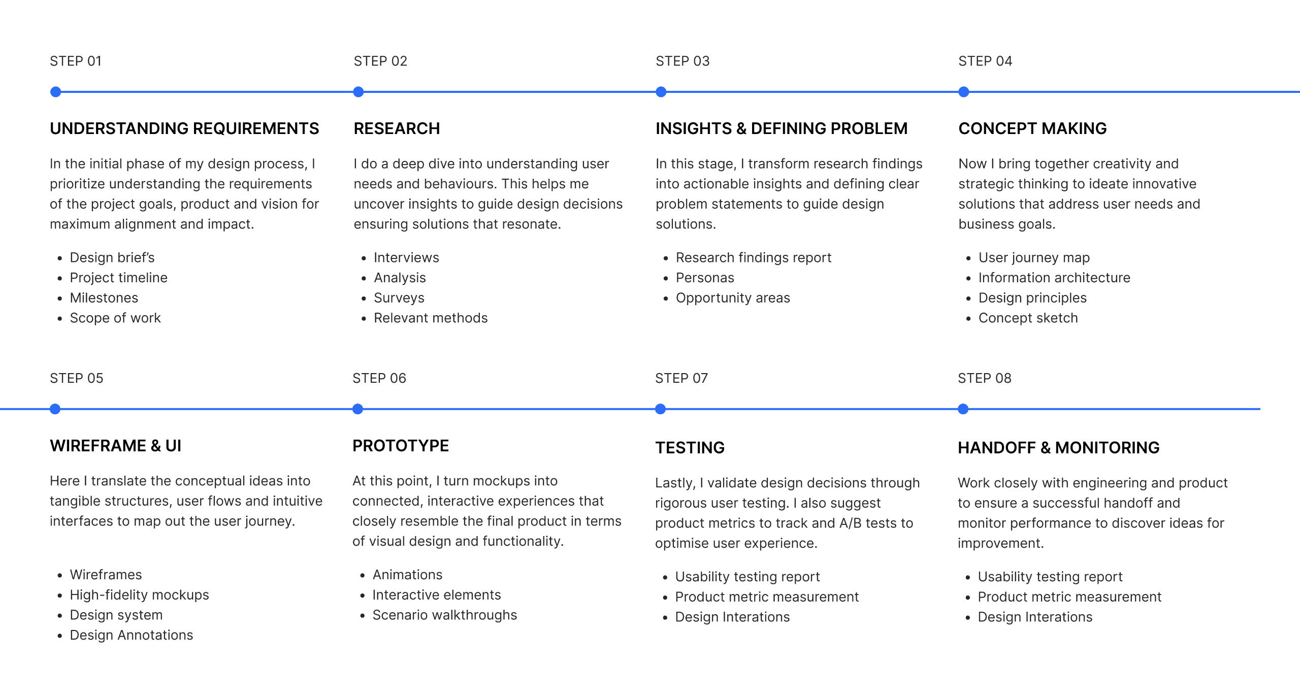
Experience

Process
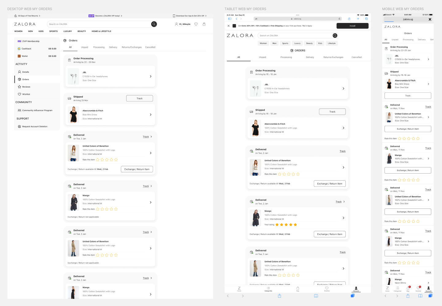
My Orders: ZALORA Post Shopping Made Smarter
Problem Statement
How we enhanced the ZALORA My Orders page to provide users with efficient access to necessary information, reducing the need for customer support assistance
My Role
Strategic Design Leadership
Enhanced User Experience
Responsive and Scalable Design
Information Architecture and Clarity
Cross-Functional Collaboration
Impact
6% reduction in CS contact rates across 6 ventures in H2’22
Estimated ~50k EUR in cost reduction related to CS
Significant boost in customer satisfaction and engagement
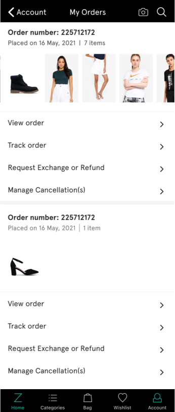
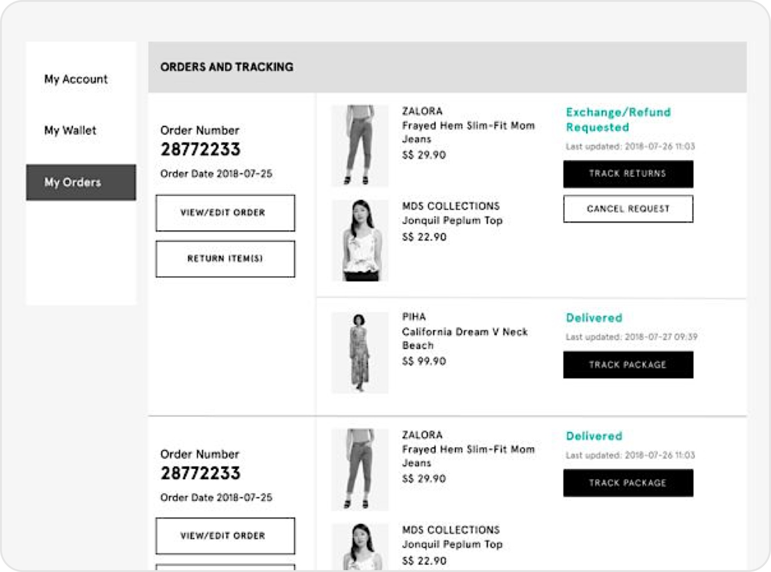
Zalora's My Orders before the redesign
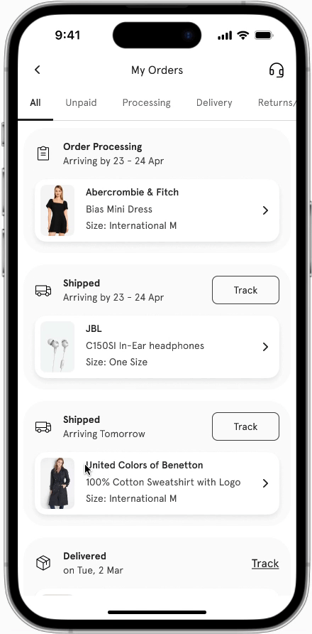
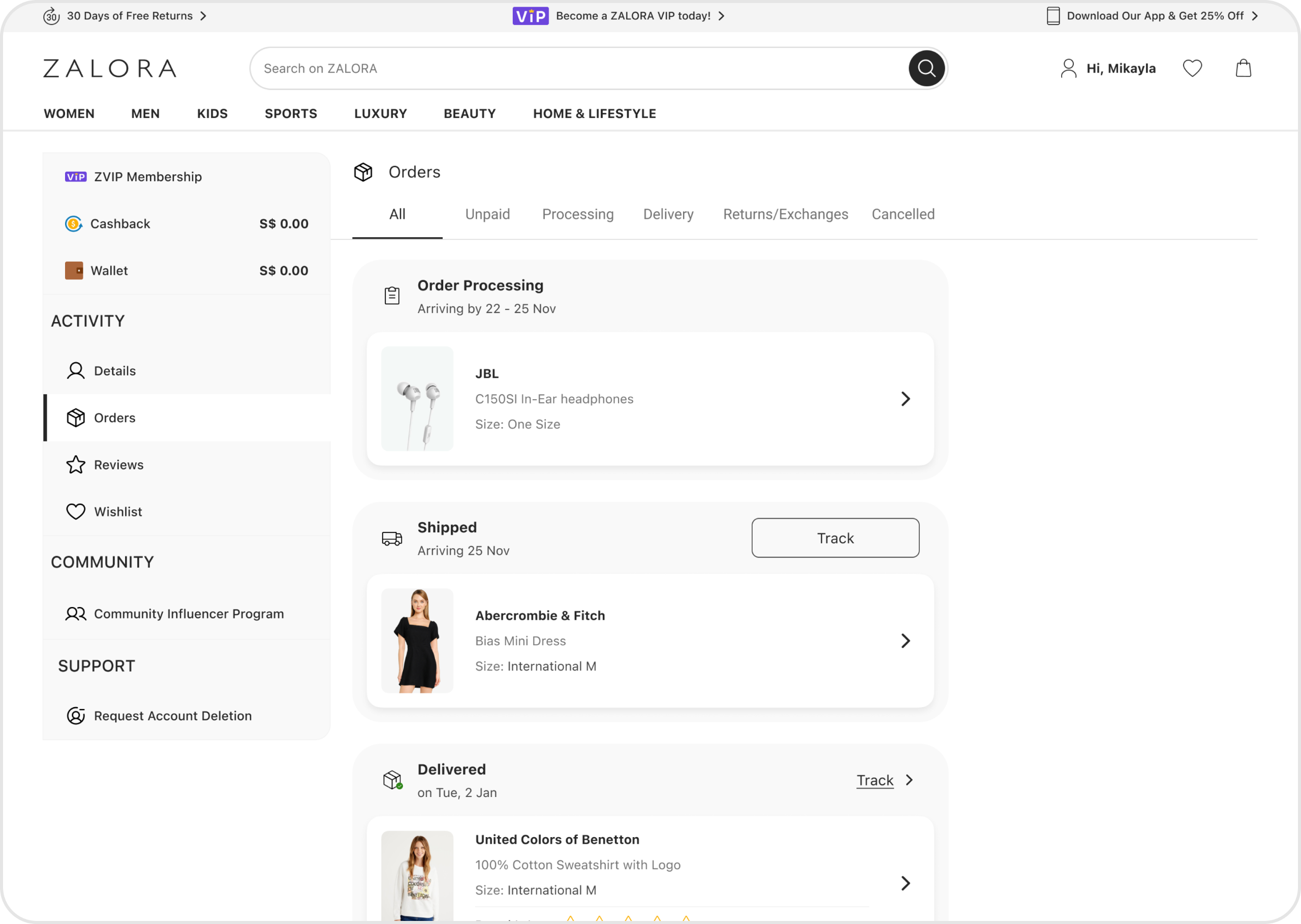
My Orders after the rebuild
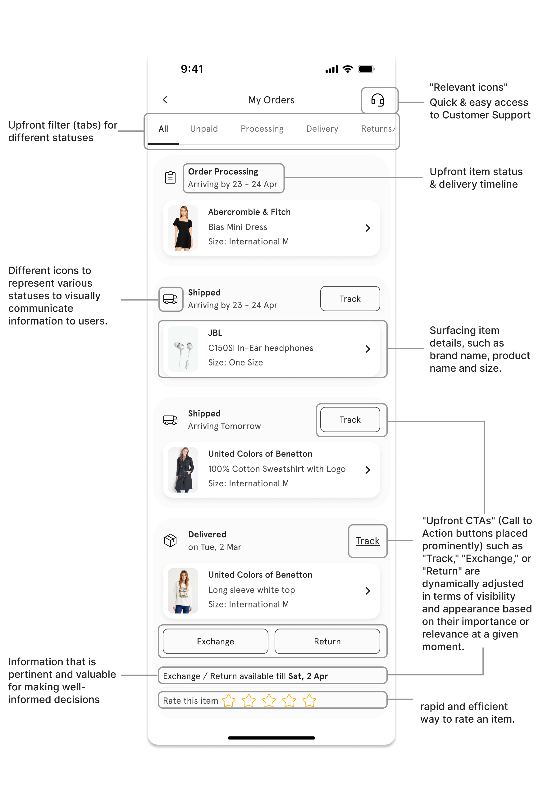
Problem #1 - Nested and Missing Information
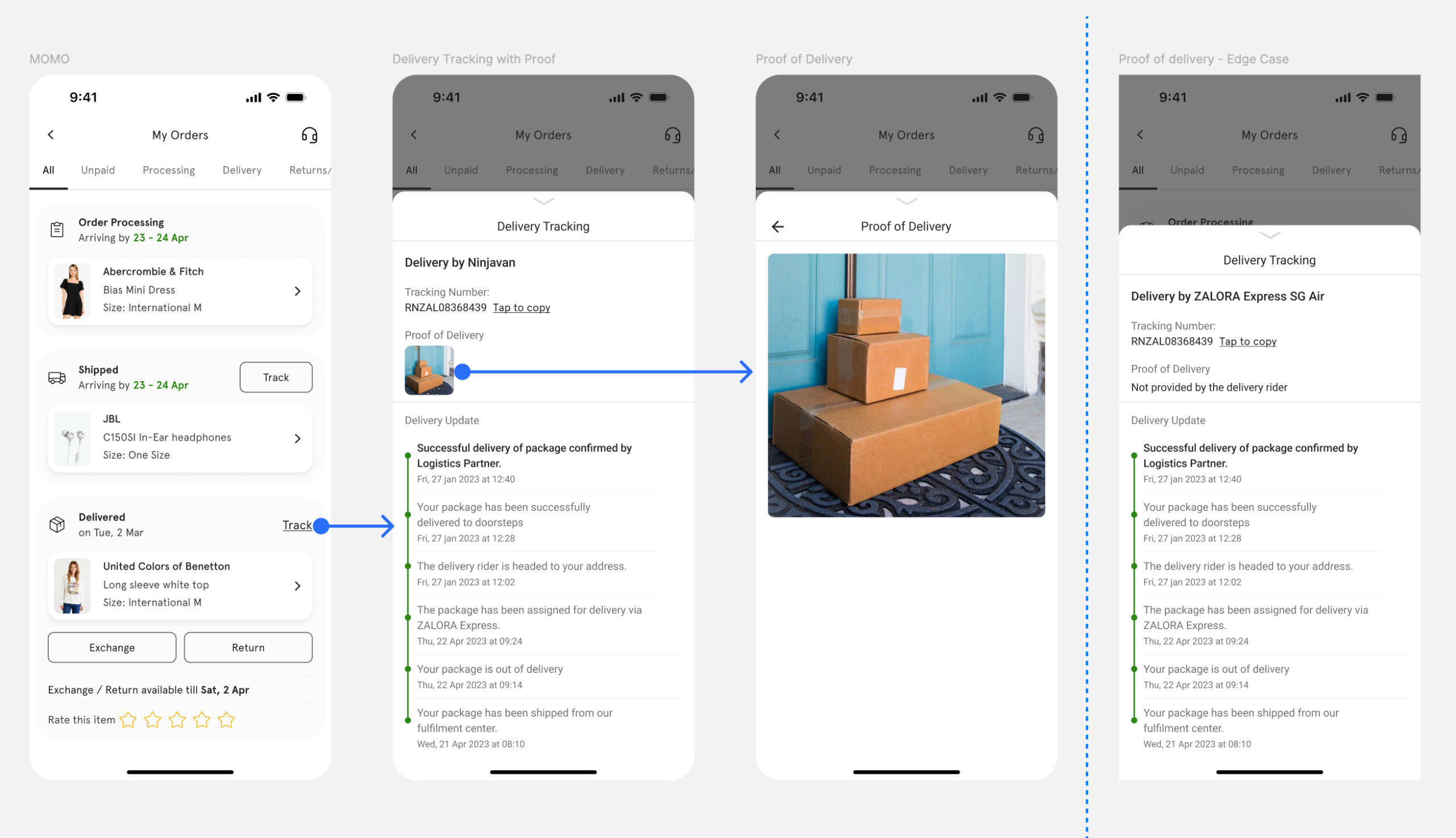
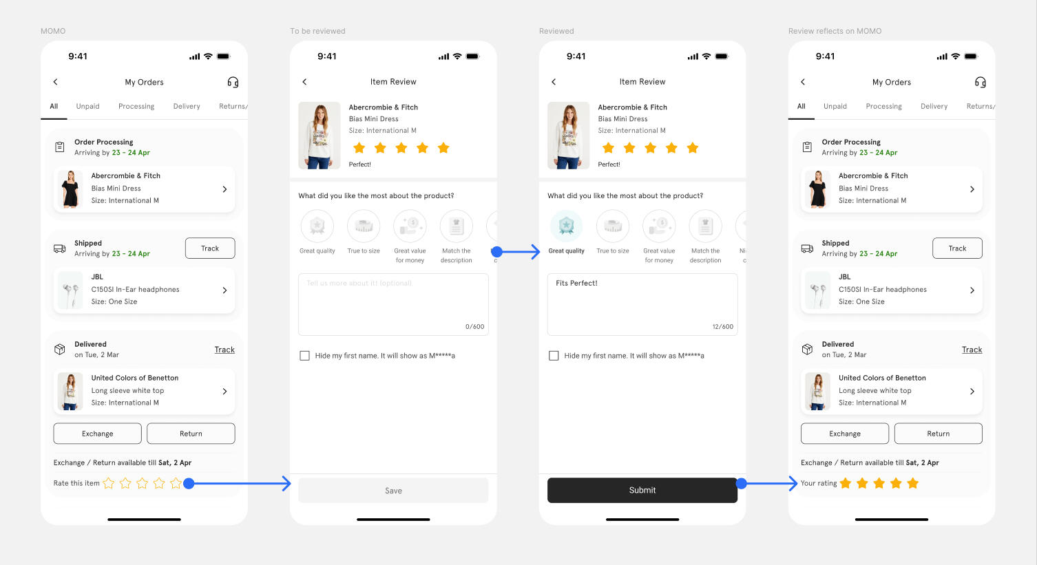
Customers encounter difficulties in locating important delivery information and tracking details for their orders.
The absence of relevant details per item, such as brand name, size, and price, is causing confusion and inconvenience for customers who need to track, review, or manage individual items within their orders
Solution Approach
My primary objective was to establish a seamless display of items.
Before designing a solution to enable easy access to delivery tracking, I focused on fixing the display of items on My Orders.
Designs
My Orders page design
Item Detail page design
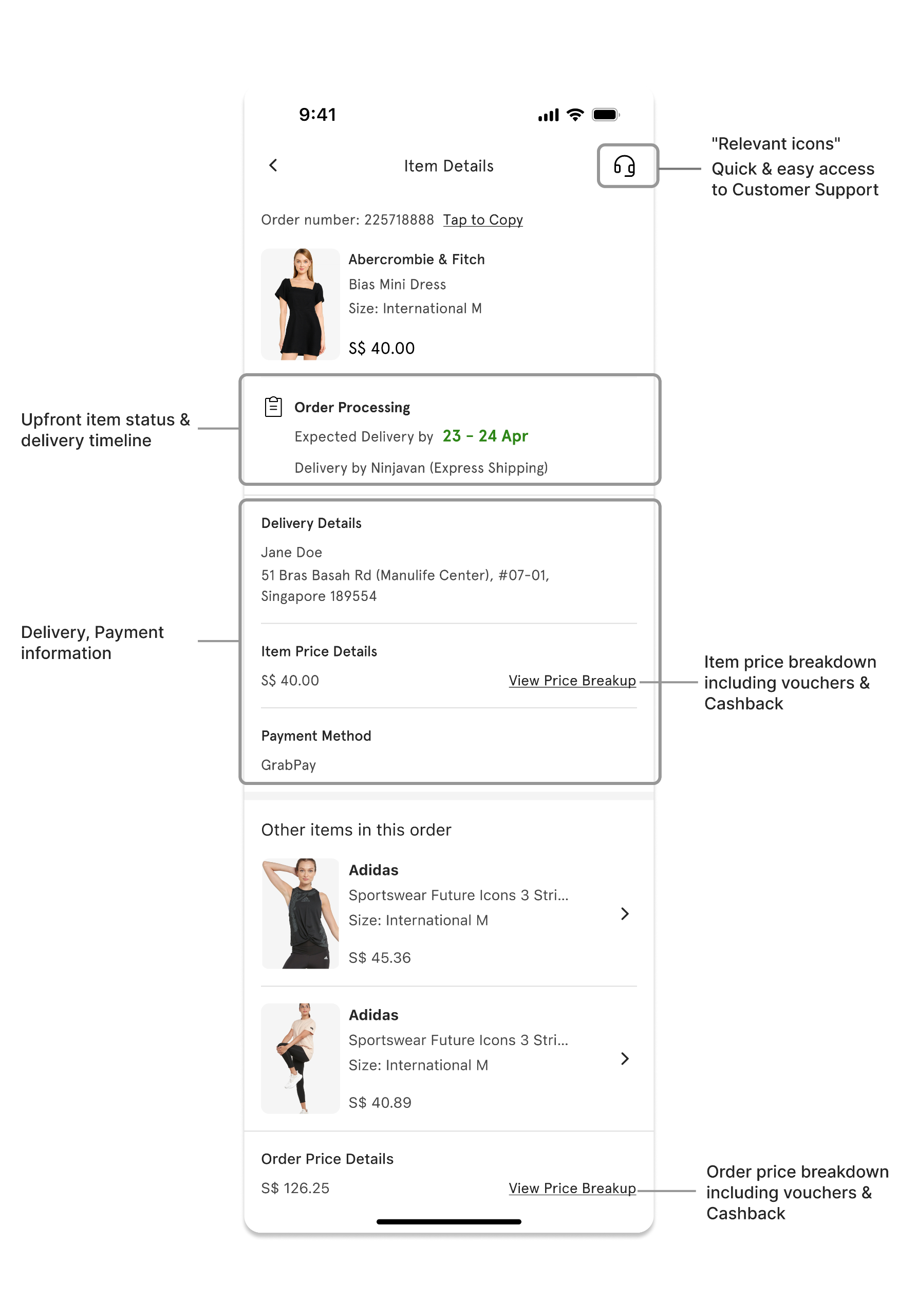
Detailed Designs
New Post Purchase experience
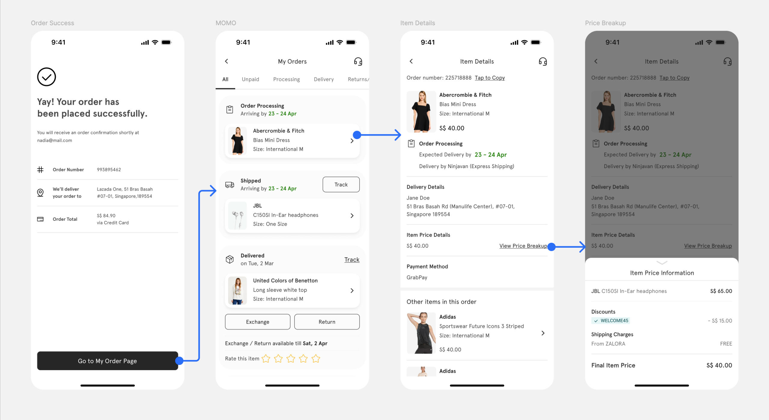
Item tracking flow
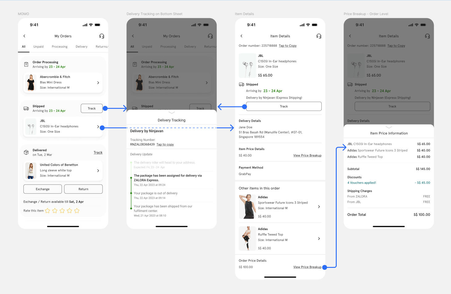
Proof of Delivery flow
Item review flow
Problem #2 - Parity with our Apps
Zalora has been a mobile-first product company for many years now; due to this our website experience constantly lags on features with our apps.
Our website needed a separate design effort each time we built new features. Hence we had to spend a huge amount of bandwidth to simply adapt our experiences for the web.
Our apps had moved to a refreshed design language — We needed to scale that language to our website to be consistent for our users.
Zalora's My Orders before the redesign
My Orders after the rebuild
Solution Approach - New Web Design
Responsive Design — We ensure the layout is responsive and optimised for various screen sizes, including tablet devices for which the design never existed.Our website needed a separate design effort each time we built new features. Hence we had to spend a huge amount of bandwidth to simply adapt our experiences for the web.
Layout & Structure — Maintained a similar layout and structure for the cart page on both web and app platforms. Kept important elements such as the item list, checkout summary, and navigation options in consistent locations.
Color Scheme and Branding — Used the same colour palette (Noir 2.0) and branding elements across both platforms to ensure a cohesive look and feel.
Empty Cart State — When the cart is empty, designed a visually appealing message or image encouraging users to continue shopping.
Designs
Visualisation of the responsive design breakpoints of the new My orders.
Release & Impact
Release
As with any major release in a large e-commerce platform, this project relied heavily on partial releases and A/B testing.The successful outcomes of the partial releases and A/B testing demonstrated the positive effects of the new checkout design on the platform's performance.
Impact
| -6% | Decrease in delivery-related customer inquiries across H2'22 |
| ~126,471 | Fewer Customer calls |
| €50K | Estimated cost reduction in Euros related to CS |
CART Enhancements: Enhancing ZALORA Shopping Experience
Problem Statement
How can the Checkout help shoppers to make a purchase in the clear way which drive higher completion rates.
My Role
Design Leadership
User-Centered Approach
Responsive and Consistent Design
Collaboration and Execution
Defined design specs (Desktop focused)
Impact
Improved Checkout Completion Rate by 6.45%
Reduced Cart Abandonments by 15%
US$ 40K Per month uplift in NMV
Enhanced overall usability
Zalora's cart before the redesign
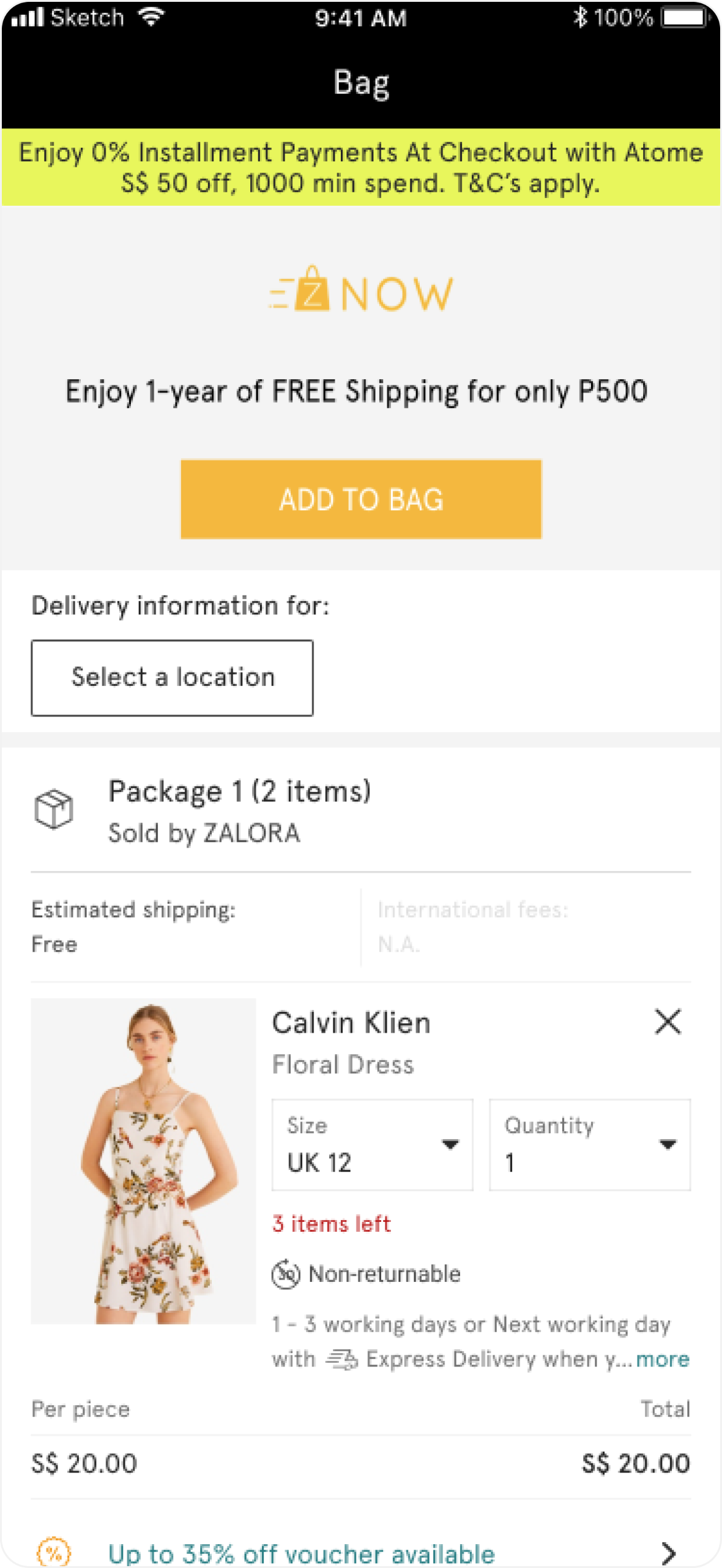
The Cart after the rebuild

Problem #1 - Too long / complicated checkout process
Customers found the checkout process to be lengthy, distracting & difficult to navigate. This has led to a significant decline in ZALORA's average checkout completion rate.
To modify cart-related details during the purchase, customers have to retrace their steps through the shipping, payment, and address sections to reach the cart.
Solution Approach
I initiated the process with brainstorming and whiteboarding sessions. My primary objective was to establish a seamless flow.
Before diving into the design phase, I focused on defining the sequential steps user needed to take and compiled a set of questions to address with each reference I explored:
What is the sequence of steps for a successful purchase in the app that keep the TRUST?
Is the flow optimised for speed, simplicity, maximum context setting, or a combination?
Strategies to minimise distractions and facilitate well-informed, prompt decision-making for users.